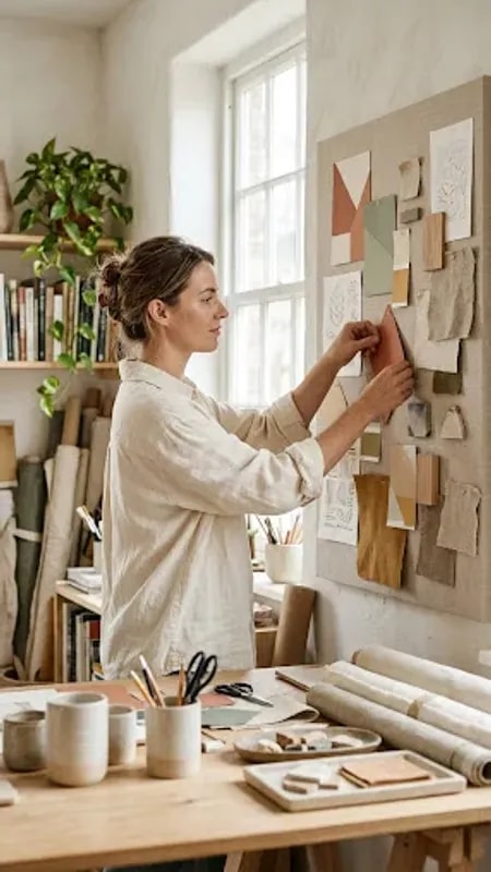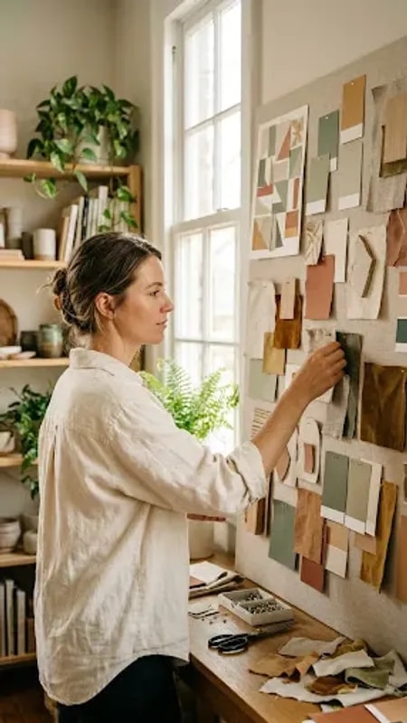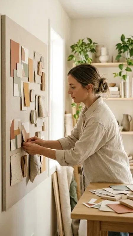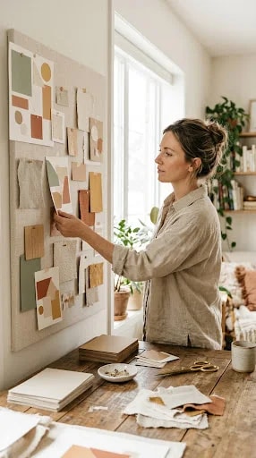
In a sun-drenched corner of a studio, a designer stands before a canvas of potential. Her mood board is not a digital collage but a tangible collection. Terracotta, sage, and cream swatches are not just colors; they are fragments of the feeling she wants the brand to embody. This careful pinning is the first crucial, physical act of giving shape to an idea. It’s a slow, thoughtful process where the hand guides the mind, allowing for serendipitous juxtapositions that a cursor could never replicate.
This tactile method is particularly vital for home style brands, which trade on warmth, authenticity, and a sense of lived-in comfort. The logo cannot feel sterile or mass-produced. By starting with textured fabric samples and hand-painted color chips, the designer ensures the final mark will carry the subtle, organic imperfections and rich depth of the materials that inspired it. The gold scissors and ceramic mug on the desk aren’t mere props; they are part of the same sensory world the brand must inhabit.
The resulting logo is never just a graphic. It becomes an artifact of this process, infused with the memory of how the light fell across the board and how the textures felt under the fingers. It tells a story of considered craftsmanship before a single digital vector is drawn. This approach builds a foundation of authenticity that resonates deeply with an audience seeking genuine connection over slick, impersonal design.
Ultimately, this image champions a philosophy where the journey is as important as the destination. It suggests that the most resonant home style logos are not merely designed but are curated, pieced together with the same care one might arrange a cherished shelf or select a perfect piece of pottery. They begin not with a blank file, but with a blank wall, a pile of swatches, and the quiet confidence to start by pinning one color next to another, building a world from the ground up.