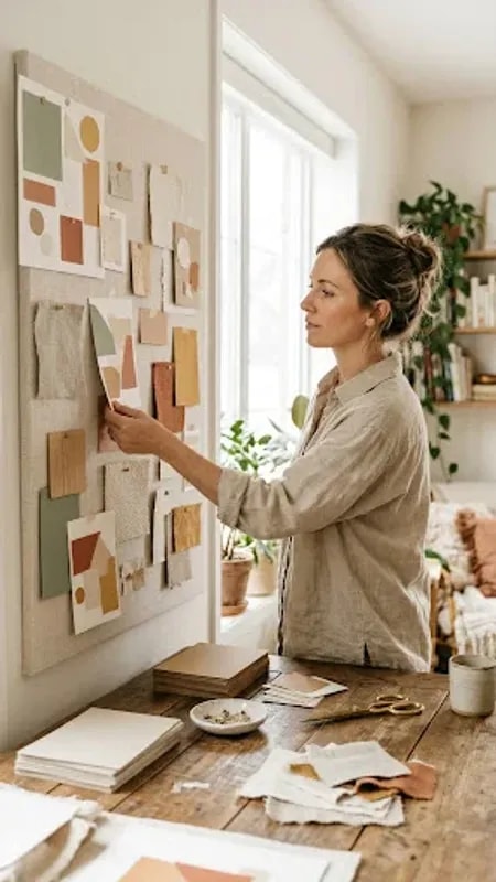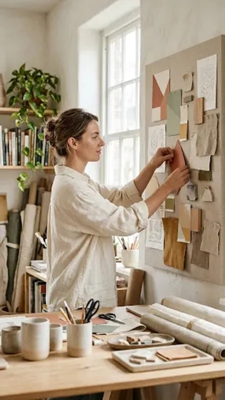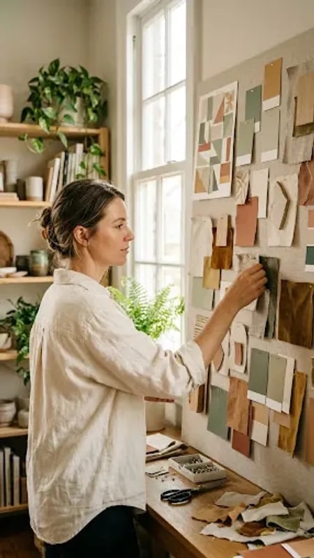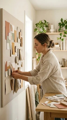
There is a moment in every home style branding project that happens before a single vector is drawn. It looks like this: a woman in a soft linen shirt, standing at a tall vertical board, pinning up squares of terracotta linen, cream paper, sage wool, and a cool soft gray. Her hands move slowly. Nothing is decided yet, and that is exactly the point. The mood board is not decoration for the client presentation — it is the raw material of the logo itself.
Palette comes first, and it comes from the physical world. A home style brand lives in rooms, so its colors should behave like the colors of a room: warm beige that holds light, a muted green that reads as calm rather than loud, a clay tone that suggests handmade ceramics. When you translate those swatches into a logo, the goal is not to match them exactly but to keep their temperature. A mark built on terracotta and sage will feel grounded and tactile; the same shapes in bright primaries would feel like a different company entirely. Pull three to five swatches from the board, name them, and let them constrain every decision that follows.
Texture is the second translation. Fabric has weight, weave, and a slight irregularity, and those qualities can survive in a logo through line and letterform. A hand-drawn arc, a wordmark with gently uneven stroke endings, a monogram set in a serif with soft shoulders — each reads as made rather than manufactured. This is where a home style identity earns its credibility. The client is selling considered interiors; the logo should feel like it was chosen by someone who touches materials all day.
Then comes restraint. A logo that only works on a wide, sunlit presentation board is not finished. Test it at the size of a woven label, stamped on a paper bag, printed in one color on a business card, and reversed out of a dark storefront window. If the mark survives those conditions, the mood board did its job. If it collapses, the answer is rarely more detail — it is usually one strong shape and one confident typeface, supported by the palette you already chose.
Keep the board up after launch. It becomes the reference point for the website, the packaging, the social grid, the way a photograph is lit. A home style logo is not a stamp applied at the end of the process; it is the most concentrated version of a feeling that started with a handful of swatches and a quiet afternoon of pinning.