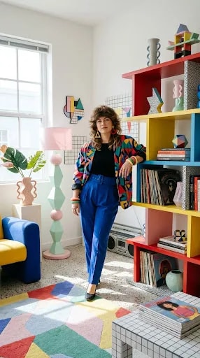
Memphis design works best when it has a boundary. Give it a whole open-plan room and the squiggles, dots and candy colors start arguing with each other; give it one sunlit corner and the same vocabulary reads as confident rather than loud. That is the trick behind this little vignette: a single bright pocket of a room, anchored by a patchwork rug and framed by a window that pours in clean, even daylight from the left. The light matters as much as the palette, because Memphis color needs to look washed and cheerful, not murky.
Start on the floor. A rug built from colored squares does the heavy lifting here, acting as a grid that quietly organizes everything standing on it. Squares are the calmest shape in the Memphis toolkit, and a checkerboard or patchwork ground lets you pile on circles, waves and zigzags above without the scene turning to noise. Keep the squares in soft pastels and let the furniture supply the primary hits. Then choose one tall vertical element to hold the corner: an open shelf unit in white or pale gray, so the objects inside do the talking.
Styling that shelf is where the personality lives. Work in geometric totems and small sculptures, a folded paper star, a few records leaning where the sleeves can be seen, patterned book spines grouped by color rather than subject. Alternate tall and short pieces, and leave real gaps, because Memphis is playful, not cluttered. Beside the shelf, a faceted floor lamp in pink and mint adds a second geometric silhouette, and a wavy pink vase with broad green leaves softens the hard edges with something alive. A chunky blue-and-yellow seat finishes the arrangement and gives the corner a reason to exist beyond looking good.
For the table, go low and simple: white tile or a plain white top, stacked with magazines whose covers echo the room's colors. White keeps the center of the composition from competing with the shelf and the rug, and it bounces the window light back into the corner. The palette to aim for is roughly two-thirds pastel, one-third bold primary, with black used sparingly as punctuation. Get that ratio right and the nostalgia reads as intentional retro confidence instead of a room stuck in a decade. The final test is simple: stand in the doorway, squint, and see whether the corner hums. If it does, stop adding things.