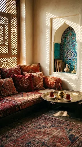
The first thing that strikes you in a Turkish room is not a single object but the order in which things reveal themselves. Your eye drops to a vintage rug, worn soft at the edges and busy with medallions. It lifts to a bank of embroidered kilim cushions in deep crimson. Then it travels up a cream plaster wall to an arched niche lined in turquoise Iznik tiles, glowing like a small private window. Nothing in the scene is expensive-looking in a showroom way, yet everything is placed with the confidence of someone who has arranged this corner a thousand times.
That upward pull is the whole trick. Turkish interiors rarely put their boldest color at eye level, where it would compete with conversation. Instead, saturated tones sit low — rugs, seat cushions, a stack of textiles — and again high, inside niches and above lintels. The middle zone stays quiet, usually a warm cream or soft ochre plaster, so the room has somewhere to breathe. If you want to borrow the effect, treat your walls as the pause and your textiles as the punctuation. One tiled or painted niche above a seating area will do more than an entire accent wall.
Pattern follows the same rule of density rather than volume. A kilim cushion against a plain linen seat, a brass tray over a floral rug, a lattice screen casting geometric shadows across the plaster — each layer is busy, but they are separated by plain surfaces and by shifts in scale. The shadow play matters as much as the fabric. Carved wooden latticework, known as mashrabiya in the wider region, doesn't just filter glare; it throws a moving geometry across the room that changes hour by hour and makes a small space feel alive.
Then there is the ritual layer, the part that turns a pretty corner into a room people actually use. A low wooden table, a brass tray, two tulip-shaped tea glasses, a small pot. That is the entire composition, and it signals hospitality more clearly than any amount of styling. Keep the tray polished but not fussy, let the glasses catch the light, and leave a little empty space around it — negative space is what makes a tray read as an invitation rather than a display.
The palette itself is easy to describe and hard to resist: terracotta, oxblood, and warm cream grounded by one cool, luminous blue. Pick the blue from your tile or ceramic, then let every other color lean earthy. Add filtered daylight, a seat deep enough to sink into, and you have the calm the photograph promises — a place to sit with tea and do absolutely nothing well.