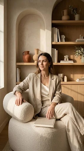
Start with the seat, not the shelf. Most corners get assembled backwards — artwork first, then a plant, then whatever chair happens to fit the leftover gap. The corner in view does the opposite. A rounded bouclé chair in a sandy oat tone sits slightly off-center, angled a few degrees toward the window, and everything else negotiates around that single decision. The chair is wide enough to curl a leg under, low enough that the arch above it reads as a frame rather than a header, and pale enough to nearly dissolve into the plaster behind it. That disappearing act is the point: the chair should feel like part of the room's atmosphere, not a piece of furniture parked in it.
Light does more of the styling here than any object. The window sits at the left, so the chair turns slightly away from it, letting daylight rake sideways across the wall instead of hitting the sitter in the face. On matte plaster, that grazing light picks up every trowel mark and softens the edges of the arch, which is why the finish matters as much as the furnishings. Glossy walls would bounce the light back hard and flatten the whole scene. A chalky, hand-finished surface holds it, warms it, and throws the gentlest shadow under the shelf line.
The shelving behind her is built in and deliberately quiet — pale wood, thin boards, uprights that echo the curve of the niche. What keeps it from looking like a store display is the range of scale. Art and design monographs stand in short vertical runs, interrupted by a few laid flat in stacks of two or three. Ceramic jugs and vases gather in loose clusters rather than spreading out evenly, with one small figure given room of its own, and a single stem in a narrow vessel breaking the horizontal lines. Leave gaps. The empty stretches of wall between objects are doing the same work as the objects.
The palette is almost entirely warm neutral — cream, oat, sand, tan, pale timber, one muted terracotta note in the ceramics — held together by texture rather than contrast. Bouclé against plaster against linen against unglazed clay: four surfaces, four different levels of softness, no black outlines anywhere. That is what separates a serene neutral room from a beige one. Without the textural variation, the same colors would read as flat; with it, they read as layered and expensive.
Finish the corner by making it usable. A closed book resting near the lap is the tell that someone actually sits here, and a low side table or a clear patch of floor for a cup completes the loop. The best reading corners are not styled to be photographed; they are styled to be returned to, and the photograph is simply what that habit looks like from across the room.