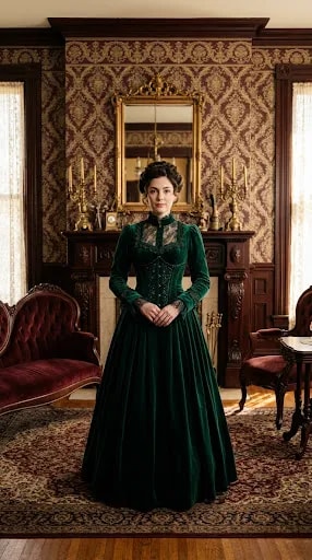
Stand at the threshold of a true Victorian parlor and the room seems to hold its breath around a center. In this scene, a woman in a floor-length emerald velvet gown stands dead center, hands clasped, and the entire interior organizes itself behind her: damask wallpaper in brown and gold, a carved walnut mantel, a gilded mirror, brass candelabra, a burgundy tufted chaise to the left and a carved chair with a side table to the right. Nothing is random. The room was built to be looked at straight on, and that is the first lesson worth borrowing.
Start with the axis before you buy a single object. Choose one wall, usually the one with the fireplace or the best window, and treat its midpoint as a spine. Everything else answers to it. Here, the mantel and mirror stack vertically on that line, the chaise and chair balance each other as a near-mirrored pair, and the rug's pattern radiates outward from the same center point. You do not need identical furniture on both sides, only equal visual weight: a heavy tufted piece on one side can be answered by a lighter chair plus a lamp or a stack of books on the other. The eye reads balance even when the objects differ.
Density is the risk. Victorian rooms accumulate pattern, and pattern on pattern can tip from rich to exhausting. The trick is to give the layers different jobs. Let the wallpaper carry the repeat, keep the upholstery solid but tactile, and let the metals provide the sparkle. Emerald velvet against brown-and-gold damask works because the green is quiet in hue and loud in texture, while the brass candelabra and gilded mirror add small, sharp highlights that keep the eye moving. If you are recreating the look, pick two dominant patterns at most and let wood grain and velvet do the rest of the talking.
Light is what keeps a layered room from feeling like a museum case. Notice how the illumination here arrives from the sides, warm and diffuse, catching the nap of the velvet and the carving on the walnut without throwing hard shadows. In a real room, that means sheer curtains left partly open, lamps placed at seated eye level, and dimmers on everything. Candlelight is period-correct but a pair of brass sconces on the mantel gives the same flicker with less soot.
Finally, edit around the center rather than adding to it. A Victorian interior feels imposing when every surface competes; it feels elegant when one vertical element dominates and the rest supports it. Choose your centerpiece, build the axis, layer texture with restraint, then remove anything that pulls the eye off the spine. The result is a room that photographs like a period-drama still and lives like a comfortable one.