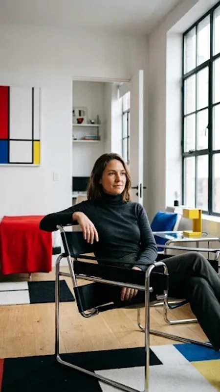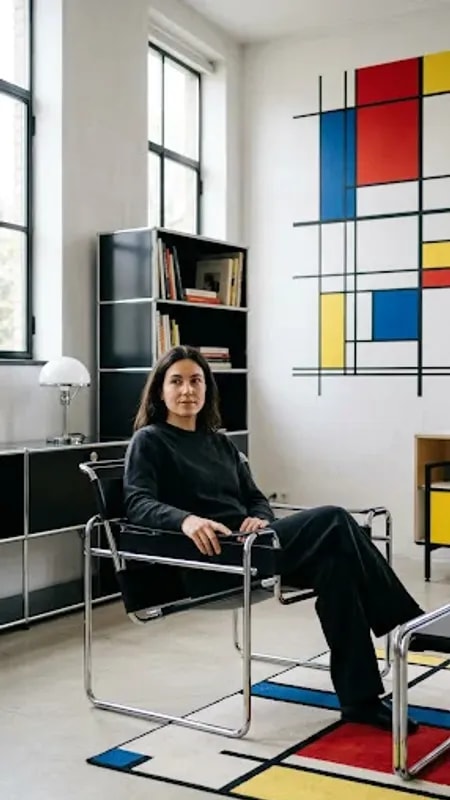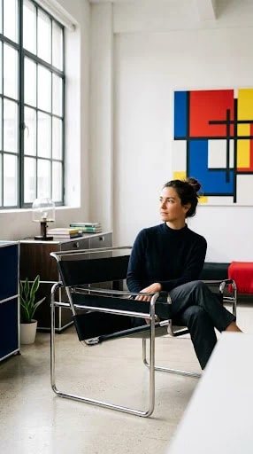
The chair does most of the talking. Its frame is a continuous loop of polished chrome, thin as a drawn line, holding a black sling that looks like it was tensioned by an engineer rather than upholstered by a craftsman. Sitting in a Wassily-style armchair in a white room is a strange pleasure: you are held by almost nothing, and the space around you stays visible. That is the whole argument of Bauhaus home design in one piece of furniture — structure exposed, ornament deleted, comfort delivered anyway.
What makes this room work is not how much Bauhaus it contains but how little. There is one painting, and it is loud: rectangles of red, blue, and yellow, black gridlines, flat as a poster. Against walls this white, that canvas reads as an event. Notice how the primaries elsewhere are rationed to a whisper — a red cushion on the black bench, a blue storage mass in the corner, a sliver of yellow on a book spine. Rationing is the discipline. If the rug, the plant pot, and the lamp all joined in, the painting would stop being a statement and become wallpaper.
Light is the second material in the room, and the window is treated as architecture rather than a hole to be dressed. Tall, industrial, uncurtained, it pours soft daylight across a polished floor that gives back a blurred second version of everything. Heavy drapes would kill this. If privacy is a concern, a sheer roller blind or a linen panel pulled to the frame's edge keeps the quality of light while softening the exposure. White walls do the rest, bouncing illumination into corners that would otherwise go grey.
The palette follows a simple ratio that is easy to copy: roughly eighty percent white and pale neutral, fifteen percent black and chrome, five percent pure primary. Black arrives as thin lines — chair frame, bench, lamp stem, window mullion — never as a big slab that would weigh the airy room down. Chrome is the bridge between white and black, catching light and giving the flat surfaces something to sparkle against. Storage is handled as a solid volume, the dark blue credenza and cabinet, so clutter disappears into a shape instead of scattering across the floor.
Furniture sits low and sparse, with visible gaps between pieces so the floor reads as continuous space. A plant, a stack of books, a glass lamp: three objects, not thirty. The temptation with a period style is to collect it, to buy the whole catalogue and arrange a museum. Resist. Choose one signature piece — the chair is the obvious candidate — and let it stand in open space with nothing crowding its silhouette. The result is a room that feels calm, cerebral, and slightly empty in the best way, a place where the geometry is quiet enough that you can hear yourself think.